![]()
For a long time I wanted to compare the different papers Blurb offers on its Publish On Demand platform. I do have an old swatch kit that I got at a trade show, but I wanted to see, feel and touch the rendering of images I know, some of mine.
Disclaimer: this blog is not sponsored, only non monetized opinions here: mine.
I wanted to learn more than I could grasp from the swatch kit. And (spoiler alert) I actually DID learn a lot from that test. So I thought it could be useful to share what I got from it as the purpose of all photograph is to be printed in a form or another.
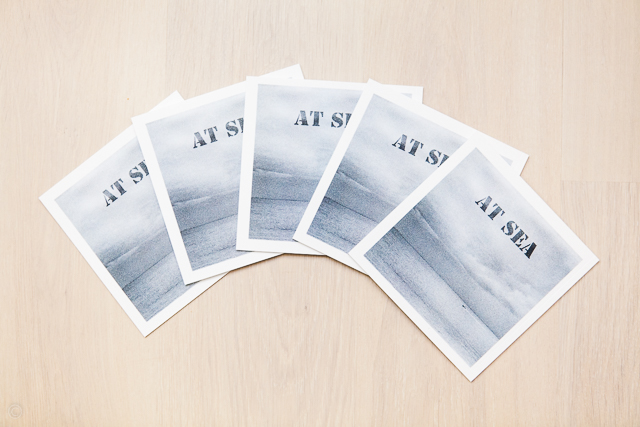
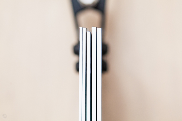
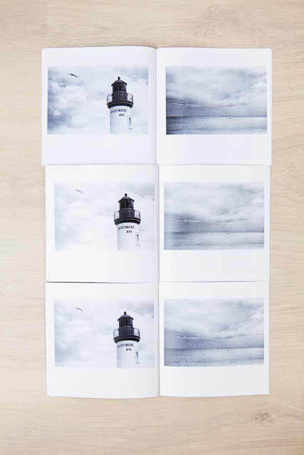
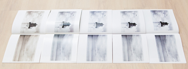
The book used for this test: Blurb Small square soft cover, 20 pages, 7×7″
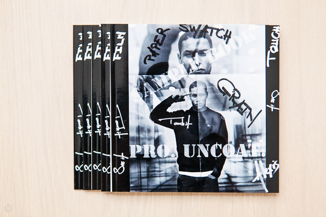
Software used to create the book: Bookwright from Blurb, I made 5 identical books, differing only in their paper type, and of course their cover title to differentiate them easily.
All photographs are scans of film negatives, exported only once and used as is for all 5 books, “copy-paste” was my motto on this test, I just had to change the title of each book, easy…
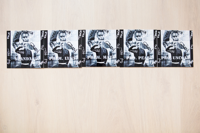
Here are the 5 paper types that where used to make these 5 identical books (A: initial book price, B: additional pages price):
- Standard – 118 gsm (*)
- Premium Luster – 148 gsm, A 33%, B 25% more expensive than 1
- Premium Matt – 148 gsm, A 33%, B 25% more expensive than 1
- ProLine Pearl – 190 gsm, A 67%, B 75% more expensive than 1
- ProLine Uncoated – 148 gsm, A 53%, B 50% more expensive than 1
(*) Enter the MKSA world my friends, one metric system to rule them all 😉
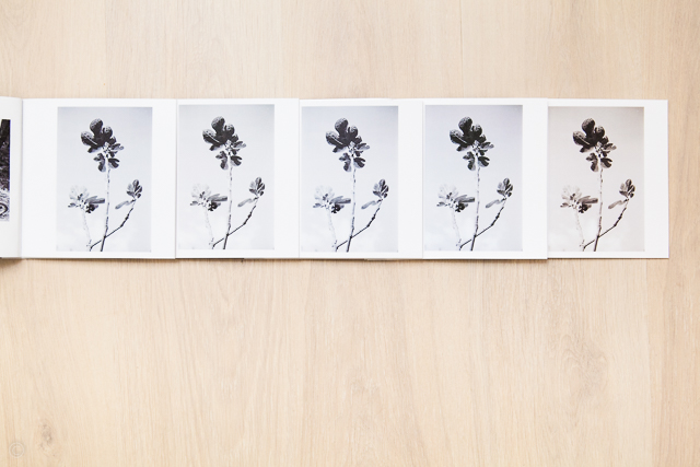
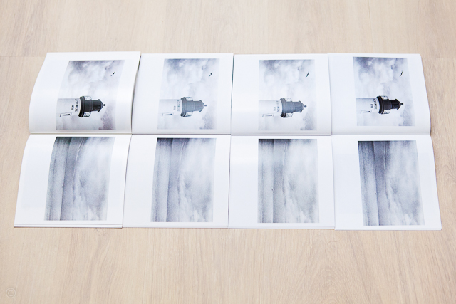
Unless stated otherwise all pictures in this post follow the same paper order from left to right.
First thing noted when opening the delivery parcel: All books don’t have the same size. Say you want to put them on a shelf, their top hedge would not align.
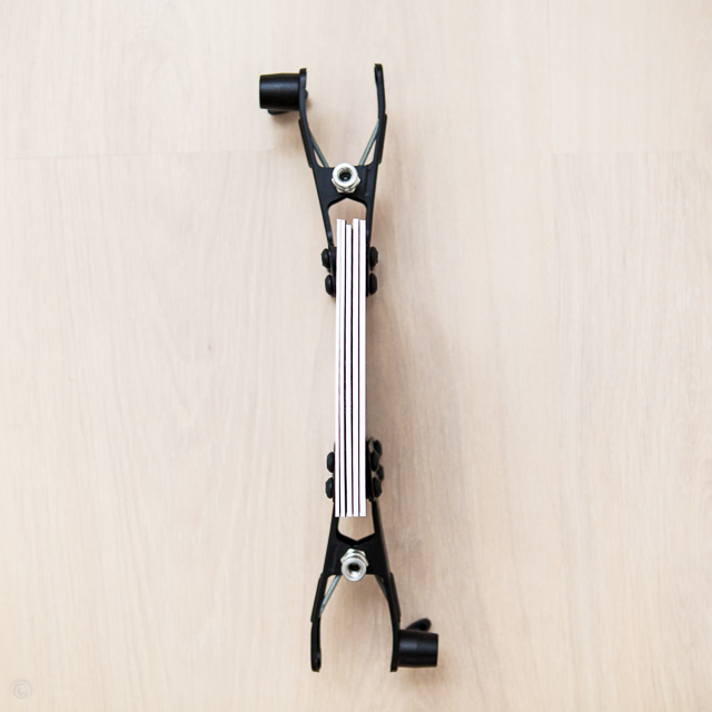
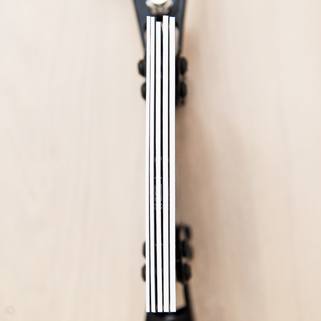
Pure and utter speculation: It is probably due to the different machines used to produce each book for which the cutters registration differs a bit, who knows?
Not a major issue, first because it’s not likely that you would want to change your paper type for each order, if it is indeed the source of the slightly differing dimensions.
Second, more importantly, if you’d want to create a nice looking (even sized) shelf collection of your own production, then you would certainly choose a hard cover, for which the issue of non matching book heights disappears.
Hard covers are more costly and were obviously not the best option for this test.
Covers: as expected they are identical. It’s the same “flexible, high-gloss laminated” thick paper cover on all 5 books. The paper type differs only at the page level.
Another minor detail that hurts the eye: the bad registration of one front cover image/design that can be seen here at the bottom left corner. Some unwanted white is creeping in from the spine… Not very pleasant, but it might be due to the small number of pages of this sample book (20 pages).
It occurs noticeably on one of the five books (the Proline Uncoated version), and slightly on another one (the Premium Matt version).
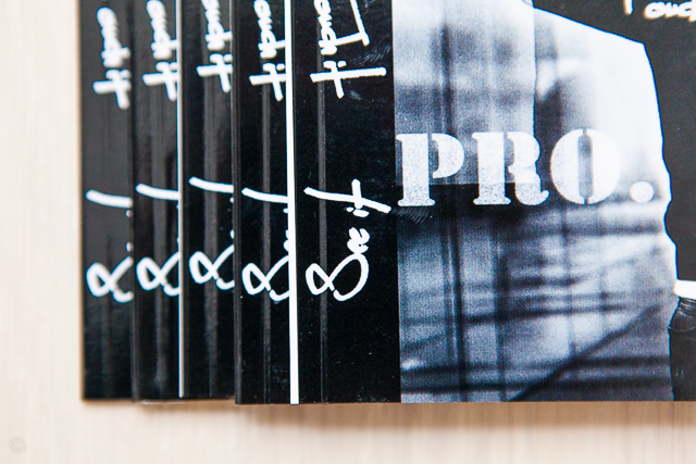
Again something that disappears with a hard cover and probably as well with a higher page count on a soft cover book.
Now onto the real thing: papers. It’s obviously almost impossible to describe a paper as it is such a subjective topic. After all we print to touch and feel what we see in the picture. So I’m not intending to provide a definitive guidance in this post. Rather I want to convey my reasoning for choosing one paper over another based on this short real life survey.
As a subjective being, I know it cannot apply to everybody, as one’s reasoning path is also somewhat subjective. But a few like minded souls might have a better clue about the advantage or disadvantage of choosing one paper type over another, based on a real life test i.e. not a paper swatch kit, made for the purpose of best showcasing each rendering.
I shoot a lot of black and white, so I’ll pay a particular attention to monochrome rendering.
First let me put out of the way the difference in shadow details and sharpness: there is no difference whatsoever to the naked eye. And as pixel peeping a print is insane I won’t foray into meaningless territory … So what’s left ? a few objective points and lot subjective ones!

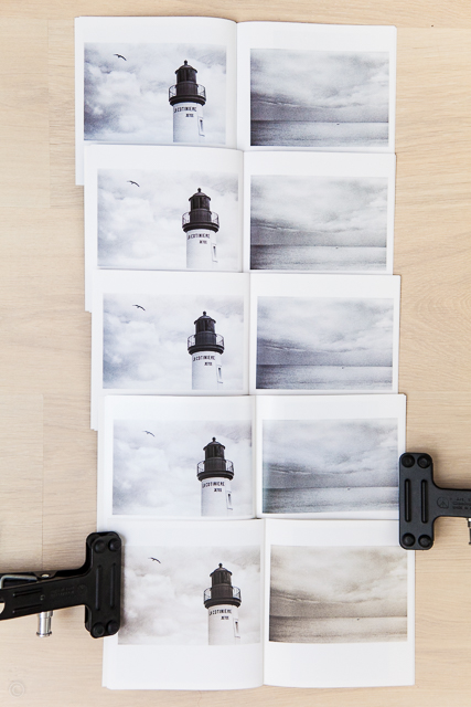
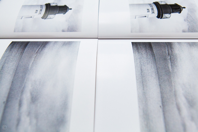
So what’s striking here ? (paper order follow western culture reading flow above)
First, shadow details and sharpness ARE strictly equal in each print which means we are working on a very sound base regarding printer tonality calibration.
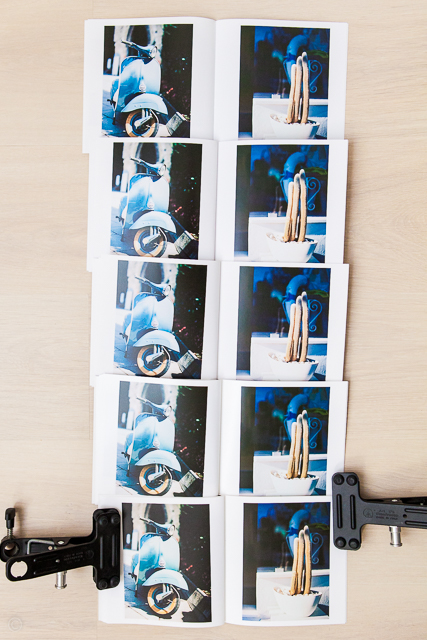
Second, color cast! we have toned monochrome images! it’s most obvious on the Proline Uncoated (bottom right) with a very warm cast.
Global contrast is similar in all paper from 2. to 5., the standard paper (top one) though seems to show a tad less contrast here, but it is more due to the way the paper takes the light on picture above. In real life the difference is less obvious. Proline Pearl has a tad more global contrast than the others.
Local contrast is also very similar from paper to paper, with a tiny bit less punch on the Proline Pearl (bottom left above). Softer local contrast may be perceived as reduced sharpness but it’s only a feeling, the details are present. Same age old debate here: what is sharpness? resolution of details or local contrast? to each his own, whatever…
Anyways what is true of one image might not be true for all so let us pursue.
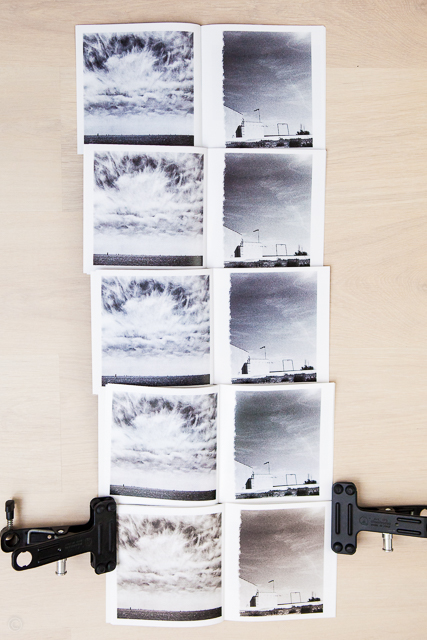
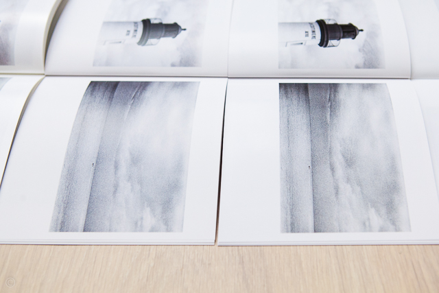
Top to bottom above: paper type 1 to 5
Same striking observation: the Proline Uncoated IS clearly warmer than the other 4.
Regarding color cast for the other 4 papers we start to see a tendency as follows: the Premium Luster seems to be a tad warmer than the Standard and the Premium Matt. The Proline Pearl hinges on a green tint.
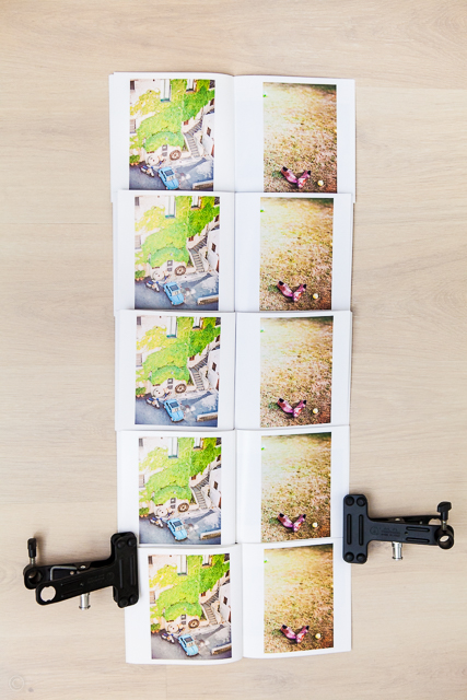
The standard one (top) however shows a more dense image here, but again it isn’t the case in real life, I can only explain that from an uneven light . I used window light, but it might also be due to the fact that the paper reflects the light differently than the other papers in this situation again. We shall see if there’s a pattern here with other examples.
Now from the above the color cast pattern is more apparent:
- Standard -top- cold
- Premium Luster -top 2d- a bit warm
- Premium Matt -top 3d- neutral to a bit cold
- Proline Pearl -top 4th- a tiny bit warm with a hint of a green tint
- Proline Uncoated -bottom- warm
Let us dive in the Black and White portrait realm to see if we can confirm this:
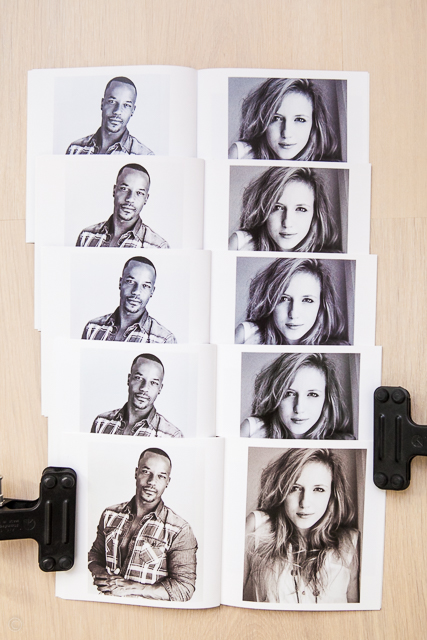
Among the top 3 the second (Premium Luster) is a bit warmer no doubt. The Standard (top) seems a bit cold for a black and white whereas the Premium Matt (third) looks more neutral. Let’s have a closer look below:
Let’s talk about the Standard paper a bit. The above picture light source, a large window, is to the left of the image, so the curved left pages have all sorts of reflections whereas the flatter right page does not suffer the same problem. Look at the girl row 1 (standard) and row 3 (Premium Matt), row 1 does not suffer any lack of contrast. Now look at the guy, row 1 and row 3, it’s obvious that the standard paper suffers from a light reflection that reduces its perceived contrast.
That’s what I was referring to a few paragraphs above. In real life the Standard paper contrast is on par with other papers, but it handles light reflections in a less flattering way than other papers.
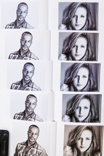
Color cast observations are the same, but I can detect you are less than convinced about the green tint of the Proline Pearl. So I give you the image below, now tell me what you see!
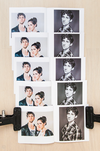
From top to bottom on the black and white portrait I see cold, warmish, neutral, green tint, warm, do you?
The color portraits should convince you of the existence of color cast differences.
On the color side I would add that the Standard paper (top) has a hint of a magenta tint, with less dense colors than the other ones. The magenta tint of this paper doesn’t make it quite the most suitable for color portrait images I’d say, but that’s just me.
On the same tone, the green tint of the Proline Pearl is still discernible on the color portraits.
Obviously, for portraits, a warm tonality in a row of image “sameness” is more eye catchy, looking at you bottom row! Also the warm cast of the Proline Uncoated (bottom) makes for a denser image.
Anyways now I think we’ll all agree that there are differences, and the most noticeable one is the color cast, even for black and white images.
Let us see more, just in case. What may be unappealing on one image might be appealing on another.
Ok pretty much same conclusion from the above apart from the fact that the Proline Pearl green tint is not much visible here nor would it be a problem if it was.
Now let us explore paper sheen for a moment. Herebelow we have Standard (top) versus Proline Pearl (bottom) the shiniest of all Blurb papers. Cheapest versus Pricest:
A matter of taste sure, but the Proline Pearl does look and feel, more pleasant and refined than the Standard.
Let’s look at the cheapest paper options, so anything but the Proline goes, Standard, Premium Luster and Premium Matt here below from top to bottom:
Standard is quite ok, but if you want to find it a defect, you may distinguish on the right page, the ghost of the picture (vertical format) on the back of the page, whereas in the two other papers, there is no visible ghost. The paper weight is a clear advantage in this regard.
Say you want a Premium paper, which one to choose? To me the real difference in THIS test is the color cast. The Luster version is not much more shiny than the Matt version. And the Matt version is not totally without shine either, these are very close paper finish. Here below: Premium Matt on the left, Premium Luster on the right
See? apart from the warmer cast on the Premium Luster (right), there isn’t much coating sheen difference. I mean, there is, but it is not major.
Personally, I’m an uncoated matt finish fanatic, but the Premium Matt has a smooth almost sleek finish, it does not have the uncoated velvet touch the Proline Uncoated has. Plus the Premium Luster has a slight warm cast that prevents black and white images from being too cold, so between Matt and Luster I’d go for the Premium Luster.
To convince you real sheen comes with Proline Pearl, here is below from left to right: Proline Pearl, Premium Matt and Premium Luster.
Same set to see the sheen, from left to right: Proline Pearl, Premium Matt, Premium Luster, Standard.
Here is the whole set, from left to right: Proline Uncoated, Proline Pearl (the shiny one), Premium Matt, Premium Luster, Standard.
So now you ask how does this compare to the swatch kit? Well I only have a swatch kit that is at least 3 years old. So I don’t have the latest and greatest swatch kit. But from the one I have the Proline Uncoated does not have any color cast, only the Proline Pearl and the Premium Luster do have a very faint color cast, so nothing like what we can see in my own book swatch.
So either the papers have changed and my swatch kit is out of date, or the Proline Uncoated is not meant to have this much color cast. I’ll order the most recent Blurb swatch kit next time around to know how papers are supposed to render images, that will tell me if the present test is on par with what it is supposed to be.
Now which paper to choose, and more importantly for what purpose?
I’ll put aside the major color cast difference on the Proline Uncoated as my gut feeling is that, maybe, this comes from a hiccup at the production level. I need to see the most recent swatch-kit to be definitive about it. And if it is the case (production level issue), I’m pretty sure the Blurb customer service will be willing to help with a second run of the books that went through an ill-calibrated machine. From experience they’re very understanding about quality requirements. Blurb runs a big production facility, so problems are meant to happen from time to time.
Let us not fool ourselves, nothing on earth is error proof, I had to re-run books with other companies that offers customized very high-end book products, at a much higher price so… the moral is: you should know what you do to form an objective opinion about it, and communicate with your suppliers to get what you need.
Now let me clarify a point here: without having other papers for reference you would NOT be able to detect a slight color cast or even a very subtle tint.
Standard Paper:
It’s a great paper really for the cost, it’s real downside is its thickness which doesn’t make it as opaque as the others i.e. you can see the ghost rectangle/square of the image printed on the back of the page.
In Blurb’s own words: “Smooth semi-matte finish”.
Regarding color and tonality rendition, it’s quite ok but lacks just a bit in punch and depth compared to the other papers. The key words here are: “just a bit”.
So for any budget tight project, this is your paper.
In my view it is best suited to a proof-copy book or more explicitly proofing a book in the intended final output format/size, before committing to an edit/sequencing/design on a more expensive paper.
The cheapest way to proof a book on the sequencing side though is to opt for the Trade Book format. Trade Books are such a great tool to test different ideas, they’re insanely cheap for the value they provide. This is another subject entirely I know but I do love this tool, the Trade Book IS a tool! I’ll get back on that another time…
Premium Luster Paper:
Best quality paper of the Blurb offering for the budget conscious creative. Not too shiny and certainly not dull, it’s the best of both world with a pleasing touch.
In Blurb’s own words it’s “More lustrous than Premium Matte”
I totally agree with the nuance. It is a Luster paper indeed, without any claim over the glossy territory, and that is fortunate! The slight warm cast rendering is so much better for black and white images than plain black over white, that often ends up feeling a bit cold.
Color is great to and benefits from the slight warm glow it provides over the Standard paper.
This is my every day paper, small project for clients (brochure etc…) or personal endeavors within the limit of a controlled budget are best served with this paper.
Premium Matt Paper:
The difference with the Premium Luster is really not marked enough to make an easy choice, you have to look for the nerd in you to make a decision based on a very acute esthetic awareness.
To me matt means no sheen at all, but it is just my way of understanding the world “matt”. Although this one is a tad less shiny than the Luster version, it retains a bit of a sheen.
In Blurb’s own terms it’s a Matt paper with a “Slight sheen to paper“
So I’m not off target (me being me, I just read Blurb notes about the paper…). Anyways for a true matt paper choice I’ll go the Proline Uncoated route.
Usually if you lean towards a matt paper kind of feel/touch you’re already in the “aware” image/print maker territory. I’ll declare it bluntly: Images that do not need reflective surface to make them pop, are like (attention, attention, sexist comment about to be launched in open internet air) women who don’t need make up to shine: true beauties. More seriously matt papers scream Fine Art, so you might want to go the whole way to Proline Uncoated and not “half-ass” your masterpiece, that is if you lean toward a matt feel and touch.
Some may argue that art reproduction or graphic design are best served with Premium Matt rather than Premium Luster. I beg to differ, the sheen of the Premium Luster is not acute enough to be a disservice to art reproduction, but again it’s just me.
All in all it’s a paper you would choose for very specific reasons, to each is own. I personally don’t see that much difference with the Luster apart from the slight warm cast. Don’t trust my eye, trust yours, you can check it easily with a swatch kit. Actually one reason that would make me choose it over the Luster would be the more neutral color cast, but that’s being picky.
Proline Pearl Photo Paper:
Reflective paper, are usually loved because they provide rich blacks i.e. blacker blacks than other non reflective papers. This being purely physics, it is true. The same goes for light/dark tones and colors in a sun lit scene just after the rain, colors pop and are saturated, dark tones go darker, light tones go lighter and the whole scene becomes naturally more contrasty and saturated. Rain droplets are indeed creating a reflective coating on Mother Nature landscape.
Glossy papers behave the same way, producing high colors and high contrast with deep blacks. The problem is that they inherently scream “make-up!” and therefore carry a cheesy connotation to the work. Yes, I have opinions, often strong ones, on pretty much all subjects, I’m french, can’t help it…
This where Pearl papers enter the scene, they are reflective surface papers but stop short of plain glossy cheesyness. So you can expect feeling richer contrasts, punchiers black but not to the point of bad taste, this is why I guess the word Photo is associated to it, because a lot would feel like the rendering is very close to true photographic paper.
In Blurb’s own words: “Made for use in high-end photo books”
My personal take on it is that it is really the most reflective paper of the Blurb offering with a classy look indeed and a bit more punch than the Premium Luster paper version. I think for this reason it will appeal to the wedding album market as its delicate shine brings the now unusual feel of photographic paper. And its thickness speaks for the importance of the images it carries.
Personally I would probably choose it for black and white landscapes work without too much vegetation rather than portraits for which I prefer a softer than punchier rendering of skin tones. I would also choose it for its more inorganic, almost mineral touch and feel, but that’s just “tiny me”, no one of importance really. Speaking of who, wait for what “tiny me” has to say on the last paper in the test.
Proline Uncoated Paper:
Ah! my beloved precious uncoated delicacy!
Expect no objective comment from me on this one!
Ok, a few unscientific points coming from “common knowledge”: with no coating the paper has a matt finish and depending on its texture the rendering might become very soft in contrast with dull dark tones and no real blacks. So these are no easy papers to master, making them belonging for ever to the realm Fine Art craftsmen, who happen to know what the heck they do, at least some do… so goes the “common understanding” of these things.
Well in this case it is completely wrong: we have deep blacks, and fantastic contrast, the Blurb guys have managed to nail the calibration of ink and paper so well, that apart from the color cast (for which I sill need to check whether it is intended or not), ALL papers are VERY well in line in term of tonality and contrast, and this obviously goes for this one as well, which makes it accessible to everyone.
BUT there is a plus, a massive, heck of an elephant in the room PLUS: its touch is almost as sensual as skin!
In Blurb’s own words: “Archival-quality paper with an eggshell-textured uncoated finish”
This is pure gibberish as it should read: our best ever paper with a smooth skin caress finish, oh! and by the way it’s archival too!
What’s not to like?
Say, you’re a “nothing but Proline paper!” guy, what will make you choose one over the other, is not punch, Proline Uncoated has plenty of punch. The decision factor is going to be intrinsically bound to the medium at use here: the book. It is not a distant medium hanged on a wall.
Before being flipped through a book is being touched, before seeing the photograph on the next page, you have to turn the page: you touch before seeing, that has a MASSIVE repercussion on your choice. Will you, or will you not consider it an experience factor in the image voyage that you are proposing to your reader.
Are you more inclined to provide an holistic experience see/touch/feel – Proline Uncoated – or rather are you more inclined to provide a down to earth and pragmatic display of your work/story/design etc… where your images are the deliberate sole entry point in your voyage proposal – Proline Pearl –
But even in the second case, you will be served well by the Proline Uncoated, but again, it’s just me and I’m totally, irrevocably partial toward the fabulous Proline Uncoated paper.
It all boils down to taste and mindset anyway, I prefer bare skin over clothing as far as touching is concerned. The clothing is artificial, it is made to enhance the looking experience, the skin is authentic, it is made to be possessed…


thank you for your observation and detail review!
you’re welcome! happy it could be useful to some 😉
That’s a huge amount of tonal difference. Did Blurb ever get back to you and comment on this. I am worried that if i choose Proline Uncoated my whites are going to be completely off. I would accept a slight tonal variation but to me it too big a difference.
Hi Oliver,
Thanks for passing by.
I did not do the follow up on that particular issue as from my experience with Blurb if anything falls off charts a quick call to customer support solves the issue rapidely i.e. in this case I’m pretty confident that they’d accept a re-run of the book. They did re-run books for me in the past on quality issues (not colorshifts issues). As this was just a test it wasn’t worth the hassle to go full circle on what I know can be solved easily.
Nevertheless this does show that once in a while things can get out of hands, even if these are rare occurences in my own experience. This however clearly shows it can happen. So as with any professional printer services, even if this one is more of a giant automat than a boutique shop, there needs to be some communication and validation on our end.
To me the service still remains one of the easiest to use with reasonable cost/quality ratio for a good coffe table book, which is their “forte” I think. For a higher control over the product (paper, stitching etc…) i.e. beyond the standard offering, one needs to go through their custom order service for an interactive one to one dialogue. That’d be more suitable for a Fine Art Book I think.
In summary, yes one needs to be careful… those who know what they do know when to push the alarm button and make a phone call.
In my experience I’ve never had a trouble free relationship with a mass printer shop. And that includes much more higher end positioned services dedicated only to serve professionals…
Always sleep one eye opened 😉
Great, detailed look into the different papers. Thanks! I’m surprised Proline Pearl is that much warmer in colour tone than the others. I started off making a few Premium Lustre books, before turning to making 5 or 6 travel books with Proline Pearl. My camera had changed so there wasn’t much I could compare. Maybe I should try the Proline Uncoated to bring back that raw texture to a wedding book I’m making.
IMHO you can’t be unsatisfied with Proline Uncoated.
As for colorshifts this type of test is quite unforgivable as any minor differences will jump to your eye. In isolation it’s nit that much obvious. Plus I must point out that color calibration clearly have gone on a tangent on the Proline Uncoated in this test, but it remains a rare occurrence.
Now perception differences will remain in normal situations as different paper finish will affect the way light is reflected (as in the Pearl cery particular finish) hence some visual differences are to be expected anyway, it’s natural.
Thank you so much for this! I’ve been researching and this has been the most helpful!!
Alexis.. thanks for this indepth and personal review of the paper choices offered by Blurb. It’s what I was looking for and the evaluations make sense. Like you I have looked at the “trade book” as an option to do a dry run of a book before going to a “photo book”. I think the choice for what I’m doing will lead me to the #100 premium paper / lustre 148gsm. I wasn’t aware that there was some ‘transparency’ to the standard paper so your evaluation has saved me a lot of research on that matter.
Your review is appreciated
best regards
Jan
From this very remote and humble place of the interwebs I’m glad to be of some help Jan,
Though the transparency remains within reason it’s real.
Thanks for your kind feedback 😉
I hope you’ll enjoy your bookmaking,
Cheers!
Alexis,
Thank you very much for providing your thorough assessment of the different papers types. I recently had a nearly 240 page portfolio printed on the Proline Uncoated paper (hardcover). I love the look of the paper, and have no regrets about it. The only issue I find is that the paper is rather stiff, making it difficult to leave the book open on a spread. This might be unavoidable, save for going with the new Layflat option. Or, perhaps, the spine will loosen up over time. However, I’m just wondering if you find that the Proline Pearl and Premium papers are more flexible and easier to flip through than the Proline Uncoated paper? Would be interested in your thoughts on that.
Thanks!
Hi Henry, thanks dor the visit.
To answer your question yes premium papers are much more “easy to flip through” although I would not put it this way as flipping through implies an easy grab of the paper for which the uncoated is easier to me but I understand you’re talking about the “flat resting” of the pages. The Proline Pearl is more flexible than the Proline Uncoated, also. Their touch is so different though, but to each is own.
Now none of these will lay flat on a 240 pages book unless the spine is “broken” if that makes sense somewhat. They will however rest somewhat closer to the table (resting in top of other pages beneath) and not stay up in the air, which the uncoated might do due to its thickness.
To me the best lay flat spine is the stitched pages kind of spine, but it’s not on their standard offering yet (only custom order). This is the only drawback of Blurb photo books as far as I am concerned. For a more pleasant viewing experience open the book in the middle and break (or flex) the glued spine so the pages lay flat. It’s possible but it gives a wrinkle to the spine which is visible once on shelves. It gives the book more of a real and used book look rather than a decorative book look, a matter of shelving choices